
1.3 Basic Concepts: Production Possibility Curve, Marginal Analysis, Incremental Analysis, Static and Dynamic Equilibrium Analysis in Microeconomics
… Hey there! Welcome to the third lesson of Unit 1. In this lesson, we will be covering Basic Concepts: Production Possibility Curve, Marginal Analysis, Incremental Analysis, Static and Dynamic Equilibrium Analysis in Microeconomics. As usual, I ask you to carefully study all these notes and think aloud or write down what you’ve learnt for effective memory. So, let’s get started.


हुन्छ Sir …..अब सुरू गरिहालौं!
Basic Concept of Production Possibility Curve
Concept of Production Possibility Curve
Definition of PPC
The Production Possibility Curve (PPC) is a curve which shows all possible combinations of two goods or services that an economy can produce with the available technology and full employment of given resource.
Assumptions of PPC
The production possibility curve is also known as the production possibility frontier and is based on the following assumptions:
1. Fixed resources: This means amount of Resources available for production remains fixed and doesn’t change during the production process
2. Fixed technology: Technology used to produce the goods is fixed and does not change during the production process.
3. Efficient use of resources: Resources are utilized efficiently without any waste.
4.Two goods: There is production of only 2 goods at a time.
Uses of PPC
The production possibility curve is very useful in understanding several economic concepts like the concept of scarcity of resources, efficiency in the use of resources, opportunity cost of producing one good in place of the other, among other concepts.
Example of PPC
For example, let’s consider a simple economy that produces only two goods: cars and computers.. The PPC illustrates the different combinations of cars and computers that can be produced when all available resources are fully utilized. Assuming the economy has a fixed amount of resources, there is a trade-off (कम्प्रोमाइज) between the production of cars and computers. If all resources are devoted to producing cars, then fewer computers can be produced, and vice versa.
The following table shows the maximum possible production combinations of cars and computers for this economy:
| Production Possibilities | Cars (in ’00) | Computers (in ’00) |
|---|---|---|
| Option A | 0 | 15 |
| Option B | 1 | 14 |
| Option C | 2 | 12 |
| Option D | 3 | 9 |
| Option E | 4 | 5 |
| Option F | 5 | 0 |
In this example, the economy can produce a maximum of 1500 units of computers if it produces no cars (Option A). Alternatively, it can produce a maximum of 500 units of cars if it produces no computers (Option F).
Between these extreme points, there are many other production possibilities. For instance, options B, C, D and E show 100 units of cars and 1400 units of computers, 200 units of cars and 1200 units of computers, 300 units of cars and 900 units of computers, 400 units of cars and 500 units of computers respectively.
The production possibility curve for this economy can be plotted using the data from the table above. The following graph shows the PPC for this economy:
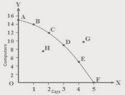
In the graph, the horizontal axis represents the production of cars and the vertical axis represents the production of computers.
Point A in the graph shows the production of 1500 units of computers and no cars. Similarly, point B shows 1400 units of computers and 100 units of cars. As the downward movement continues to points C, D and E, the production of computers decreases and the production of cars increases. At the final point F, when 500 units of cars are produced, there is no production of computers.
When all the points A, B, C, D, E and F are joined, we have the curve AF. This curve is the production possibility curve for the given economy.
The curve shows the maximum combinations of cars and computers that can be produced with the available resources and technology. Any point inside the curve (for example, point H) represents an inefficient use of resources, while any point outside the curve (for example, point G) is unattainable with the given resources and technology.
Causes of Shift in Production Possibility Curve
A shift in the PPC occurs when there is a change in the economy’s production capacity, which can be caused by several factors.This shift can be either outward or inward. Outward shift in PPC indicates increase in production whereas inward shift in the PPC indicates decrease in production.
#Causes of Outward Shift in PPC:
◯ Technological progress: Technological advances can increase the efficiency of production and result in an outward shift in the PPC. With the same resources, more cars and computers can be produced.
◯ Increase in resources: An increase in the availability of resources, such as labor or capital, can also result in an outward shift of the PPC. With more resources, the economy can produce more of both goods.
◯ Improvement in education and skills: Improvements in education and skills can also lead to an outward shift in the PPC. More educated and skilled workers can produce more output with the same amount of resources.
#Causes of Inward shift in PPC:
○ Natural disasters: Disasters, such as earthquakes or floods, can reduce the availability of resources or damage infrastructure, leading to a decrease in production capacity and an inward shift in the PPC.
○ Wars: Wars can also destroy different productive resources leading to the inward shift of the PPC.
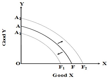
In the figure given here, the curve AF is the initial PPC. With an increase in the economy’s production capacity, the initial PPC will shift outward to the right from AF to A2F2 . Coversely, in case of decrease in the production capacity of the economy, the initial PPC will shift inward to the left from AF to A1F1 .
Definition of Production Possibility Curve
A production possibility curve (PPC), also known as a production possibility frontier (PPF), is a graphical representation of the possible combinations of two goods that an economy can produce given its resources and technology, assuming all resources are fully utilized.
The PPC is typically drawn as a curve that shows the trade-off between the production of two goods. It shows the maximum amount of one good that can be produced for every possible level of production of the other good, assuming that all resources are being used efficiently.
Uses of Production Possibility Curve
The PPC is useful for illustrating several economic concepts:
- Scarcity: The PPC shows that resources are limited, and an economy must make choices about how to allocate its resources between the production of different goods. The PPC illustrates the concept of opportunity cost, which is the cost of producing one good in terms of the foregone production of another good.
- Efficiency: The PPC shows the maximum amount of output that an economy can produce with its resources and technology. Any point on the PPC represents an efficient use of resources, while any point inside the PPC represents an inefficient use of resources.
- Economic growth: The PPC can shift outward over time if an economy increases its resources, improves its technology, or both. This shows the potential for economic growth, which is the increase in the production of goods and services over time.
- Trade-offs: The PPC shows the trade-offs that an economy must make when it produces more of one good and less of another. The slope of the PPC represents the opportunity cost of producing one good in terms of the other good.
In summary, the PPC is a useful tool for illustrating several important economic concepts, including scarcity, efficiency, economic growth, and trade-offs. It provides a visual representation of the choices that an economy must make when allocating its resources between the production of different goods.
Basic Concept of Marginal Analysis & Incremental Analysis
Marginal Analysis and Incremental Analysis
Marginal analysis and incremental analysis are both economic concepts that are used to make decisions about how to allocate resources.
Marginal analysis is the comparison of the marginal benefit of an action to the marginal cost of that action. The marginal benefit is the additional benefit that is gained from taking an action. The marginal cost is the additional cost that is incurred from taking an action.
For example, a firm might use marginal analysis to decide whether to produce one more unit of output. The marginal benefit of producing one more unit of output is the additional revenue that the firm would earn from selling that unit of output. The marginal cost of producing one more unit of output is the additional cost that the firm would incur in producing that unit of output.
If the marginal benefit of producing one more unit of output is greater than the marginal cost of producing one more unit of output, then the firm should produce that unit of output. However, if the marginal benefit of producing one more unit of output is less than the marginal cost of producing one more unit of output, then the firm should not produce that unit of output.
Incremental analysis is similar to marginal analysis, but it focuses on the difference between two alternatives. For example, a firm might use incremental analysis to decide whether to buy a new machine or continue using its old machine. The firm would compare the incremental costs and benefits of each option. The option with the lower incremental cost would be the better choice.
The incremental benefit of investing in the new machine is the difference between the revenue that the firm would earn with the new machine and the revenue that the firm would earn without the new machine. The incremental cost of investing in the new machine is the difference between the cost of the new machine and the cost of continuing to use the old machine.
If the incremental benefit of investing in the new machine is greater than the incremental cost of investing in the new machine, then the firm should invest in the new machine. However, if the incremental benefit of investing in the new machine is less than the incremental cost of investing in the new machine, then the firm should not invest in the new machine.
Both marginal analysis and incremental analysis are useful tools for making economic decisions. They can help businesses to allocate resources efficiently and to make the best possible decisions about their future.
Basic Concept of Static & Dynamic Equilibrium Analysis in Microeconomics
Static and dynamic equilibrium analysis are two different methods of analysing economic activities. These two methods of analysis are discussed separately below.
Static Equilibrium Analysis
When an economic activity is analysed under static or still conditions, it is known as static equilibrium analysis.
Static equilibrium analysis is further classified into two types, as discussed below.
a. Micro Static Analysis:
Micro static equilibrium analysis is a type of equilibrium analysis that studies a single market at a specific point in time, where supply and demand for a particular good are in balance. It involves studying how the quantity supplied by producers equals the quantity demanded by consumers, resulting in a equilibrium market price.
The concept of micro static equilibrium analysis can be explained with the help of the following figure:
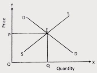
In the figure, DD and SS represent the demand curve and supply curve respectively. These curves intersect at point E. The point E is the equilibrium point because at this point both the quantity demanded and quantity supplied are equal. Similarly, OP and OQ are the equilibrium price and quantity respectively. Since price and quantity demanded and quantity supplied are related to the same point of time, it can be called the micro static equilibrium analysis.
b. Comparative Mico Static Analysis:
Comparative micro static analysis is the comparative study of two different equilibrium positions at different points of time. In other words, it is the comparative study of the initial equilibrium position and the final equilibrium position.
The concept of micro static equilibrium analysis can be explained with the help of the following figure:
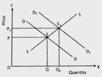
In the given figure, E is the initial equilibrium point where OP is the initial equilibrium price and OQ is the initial equilibrium quantity. Now, let’s assume that the demand for the given good increases due to , let’s say, consumers’ increase in income. The increase in demand causes the demand curve to shift upward as shown by the curve D1D1 in the figure. This new demand curve D1D1 and the supply curve SS intersect at point E1 which is the new equilibrium point. At this point, the new equilibrium price and quantity are OP1 and OQ1 respectively. In this way, the comparative study of these two equilibrium points E and E1 can be termed as the comparative micro static equilibrium analysis.
Dynamic Equilibrium Analysis
Dynamic equilibrium analysis in microeconomics is also known as micro dynamic analysis. Micro dynamic analysis is the study of the process by which the system moves from one equilibrium point to another.
The concept of micro dynamic equilibrium analysis can be explained with the help of the following figure:
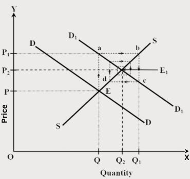
In the given figure, point E is the initial equilibrium point. At this point, the initial equilibrium price and quantity are OP and OQ respectively. As the demand increases, the demand curve shifts upward from DD to D1D1. This means demand is exceeding the supply, which exerts upward pressure on price. Because of this, the price increases from OP to OP1. At OP1, demand is less than supply. This exerts downward pressure on price. This process continues in different steps (as shown by the points a, b, c, d … ) until the new equilibrium is achieved. This process and the path of change is shown by the arrows in the figure. In this way, it is clear that microdynamic analysis shows the movement of market interactions and transactions from one equilibrium point to another.

तपाईं अहिले TU Solution भन्ने tab मा हुनुहुन्छ
यहाँ तपाईंले यस chapter बाट अहिलेसम्म TU मा सोधिएका सबै question र त्यसको solution पाउनसक्नुहुन्छ। Question हरु chapter को topics अनुसार serially राखिएको छ।
Group A – Brief Answer Questions
Chapterwise Notes in Q & A Format for Group A
Meaning, Scope, Uses and Limitations of Microeconomics
Q) What is production possibility curve?
→ A Production Possibility Curve is a curve that shows all possible combinations of two goods which an economy can produce with the available technology and full employment of given resources.
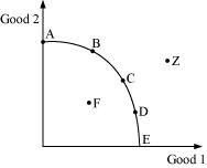
→ In the above diagram, the curve AE is the production possibility curve
(Note: The explanation below is not needed for the 2-Mark question in your exam. It is given here just for your understanding.)
[ All of the points on the PPC, that is, curve AE, are associated with various quantities of good 1 and good 2 produced by fully and efficiently utilizing the available resources. While any point below the curve, such as F, represents inefficiency or under-utilization of existing resources, the point outside the curve, such as Z, represents over-utilization of the available resources and technology.]
Q) What are the assumptions for a PPC?
→ A PPC is drawn on the following assumptions:
i) Resources are given (fixed)
ii) Resources are fully and effectively employed
iii) Technology is given and does not change.
Q) What does a rightward shift of production possibility curve indicate?
→ It indicates growth of resources.
Q) What do you mean by marginal analysis?
→ Marginal analysis is a decision-making tool that involves examining the impact of small changes or adjustments on the overall result of an action.
→ By focusing on the impacts of such changes, decision-makers can make more informed choices about how to allocate resources or take action.
Q) What do you mean by incremental analysis?
→ Incremental analysis is a decision-making tool that involves comparing the additional costs and benefits of different options to determine which option is the most beneficial. By using incremental analysis, decision-makers can evaluate the costs and benefits of each option and make more informed choices about how to allocate resources or take action.
Q) Define micro static equilibrium analysis.
→ Micro static equilibrium analysis is a method used in microeconomics to determine the market equilibrium of a particular product or service at a given point in time, assuming that the factors affecting the market, such as technology, consumer preferences, and income levels, remain unchanged.
→ In micro static equilibrium analysis, the goal is to find the price and quantity at which the quantity supplied equals the quantity demanded, resulting in a market equilibrium. At equilibrium, there is no excess demand or supply in the market, and the price and quantity are stable.
Q) What is comparative micro static analysis?
→ Comparative micro static analysis is the comparative study of different equilibrium positions at different points of time. In other words, it is the comparison of initial equilibrium position with the final equilibrium position.
Q) What is micro dynamic analysis.
→ Micro dynamic analysis is a method used in microeconomics to analyze how the market equilibrium of a particular product or service changes over time, taking into account changes in the underlying factors affecting the market, such as technology, consumer preferences, and income levels.
→ Unlike micro static equilibrium analysis, which assumes that these underlying factors remain constant, micro dynamic analysis recognizes that these factors are subject to change over time and can have a significant impact on the supply and demand for a particular good or service.
Group B – Descriptive Answer Questions
Chapterwise Notes in Q & A Format for Group B
Basic Concept of Production Possibility Curve
Q) Explain the concept of production possibility curve. What are the causes of shift in production possibility curve?
Concept of Production Possibility Curve
Definition of PPC
The Production Possibility Curve (PPC) is a curve which shows all possible combinations of two goods or services that an economy can produce with the available technology and full employment of given resource.
Assumptions of PPC
The production possibility curve is also known as the production possibility frontier and is based on the following assumptions:
1. Fixed resources: This means amount of Resources available for production remains fixed and doesn’t change during the production process
2. Fixed technology: Technology used to produce the goods is fixed and does not change during the production process.
3. Efficient use of resources: Resources are utilized efficiently without any waste.
4.Two goods: There is production of only 2 goods at a time.
Uses of PPC
The production possibility curve is very useful in understanding several economic concepts like the concept of scarcity of resources, efficiency in the use of resources, opportunity cost of producing one good in place of the other, among other concepts.
Example of PPC
For example, let’s consider a simple economy that produces only two goods: cars and computers.. The PPC illustrates the different combinations of cars and computers that can be produced when all available resources are fully utilized. Assuming the economy has a fixed amount of resources, there is a trade-off (कम्प्रोमाइज) between the production of cars and computers. If all resources are devoted to producing cars, then fewer computers can be produced, and vice versa.
The following table shows the maximum possible production combinations of cars and computers for this economy:
| Production Possibilities | Cars (in ’00) | Computers (in ’00) |
|---|---|---|
| Option A | 0 | 15 |
| Option B | 1 | 14 |
| Option C | 2 | 12 |
| Option D | 3 | 9 |
| Option E | 4 | 5 |
| Option F | 5 | 0 |
In this example, the economy can produce a maximum of 1500 units of computers if it produces no cars (Option A). Alternatively, it can produce a maximum of 500 units of cars if it produces no computers (Option F).
Between these extreme points, there are many other production possibilities. For instance, options B, C, D and E show 100 units of cars and 1400 units of computers, 200 units of cars and 1200 units of computers, 300 units of cars and 900 units of computers, 400 units of cars and 500 units of computers respectively.
The production possibility curve for this economy can be plotted using the data from the table above. The following graph shows the PPC for this economy:
In the graph, the horizontal axis represents the production of cars and the vertical axis represents the production of computers.
Point A in the graph shows the production of 1500 units of computers and no cars. Similarly, point B shows 1400 units of computers and 100 units of cars. As the downward movement continues to points C, D and E, the production of computers decreases and the production of cars increases. At the final point F, when 500 units of cars are produced, there is no production of computers.
When all the points A, B, C, D, E and F are joined, we have the curve AF. This curve is the production possibility curve for the given economy.
The curve shows the maximum combinations of cars and computers that can be produced with the available resources and technology. Any point inside the curve (for example, point H) represents an inefficient use of resources, while any point outside the curve (for example, point G) is unattainable with the given resources and technology.
Causes of Shift in Production Possibility Curve
A shift in the PPC occurs when there is a change in the economy’s production capacity, which can be caused by several factors.This shift can be either outward or inward. Outward shift in PPC indicates increase in production whereas inward shift in the PPC indicates decrease in production.
#Causes of Outward Shift in PPC:
◯ Technological progress: Technological advances can increase the efficiency of production and result in an outward shift in the PPC. With the same resources, more cars and computers can be produced.
◯ Increase in resources: An increase in the availability of resources, such as labor or capital, can also result in an outward shift of the PPC. With more resources, the economy can produce more of both goods.
◯ Improvement in education and skills: Improvements in education and skills can also lead to an outward shift in the PPC. More educated and skilled workers can produce more output with the same amount of resources.
#Causes of Inward shift in PPC:
○ Natural disasters: Disasters, such as earthquakes or floods, can reduce the availability of resources or damage infrastructure, leading to a decrease in production capacity and an inward shift in the PPC.
○ Wars: Wars can also destroy different productive resources leading to the inward shift of the PPC.
In the figure given here, the curve AF is the initial PPC. With an increase in the economy’s production capacity, the initial PPC will shift outward to the right from AF to A2F2 . Coversely, in case of decrease in the production capacity of the economy, the initial PPC will shift inward to the left from AF to A1F1 .
Q) Define Production Possibility curve. How is the production possibility curve useful to illustrate the economic concepts?
Definition of Production Possibility Curve
A production possibility curve (PPC), also known as a production possibility frontier (PPF), is a graphical representation of the possible combinations of two goods that an economy can produce given its resources and technology, assuming all resources are fully utilized.
The PPC is typically drawn as a curve that shows the trade-off between the production of two goods. It shows the maximum amount of one good that can be produced for every possible level of production of the other good, assuming that all resources are being used efficiently.
Uses of Production Possibility Curve
The PPC is useful for illustrating several economic concepts:
- Scarcity: The PPC shows that resources are limited, and an economy must make choices about how to allocate its resources between the production of different goods. The PPC illustrates the concept of opportunity cost, which is the cost of producing one good in terms of the foregone production of another good.
- Efficiency: The PPC shows the maximum amount of output that an economy can produce with its resources and technology. Any point on the PPC represents an efficient use of resources, while any point inside the PPC represents an inefficient use of resources.
- Economic growth: The PPC can shift outward over time if an economy increases its resources, improves its technology, or both. This shows the potential for economic growth, which is the increase in the production of goods and services over time.
- Trade-offs: The PPC shows the trade-offs that an economy must make when it produces more of one good and less of another. The slope of the PPC represents the opportunity cost of producing one good in terms of the other good.
In summary, the PPC is a useful tool for illustrating several important economic concepts, including scarcity, efficiency, economic growth, and trade-offs. It provides a visual representation of the choices that an economy must make when allocating its resources between the production of different goods.
Basic Concept of Marginal Analysis & Incremental Analysis
Q) Explain the concepts of marginal analysis and incremental analysis in microeconomics.
Marginal Analysis and Incremental Analysis
Marginal analysis and incremental analysis are both economic concepts that are used to make decisions about how to allocate resources.
Marginal analysis is the comparison of the marginal benefit of an action to the marginal cost of that action. The marginal benefit is the additional benefit that is gained from taking an action. The marginal cost is the additional cost that is incurred from taking an action.
For example, a firm might use marginal analysis to decide whether to produce one more unit of output. The marginal benefit of producing one more unit of output is the additional revenue that the firm would earn from selling that unit of output. The marginal cost of producing one more unit of output is the additional cost that the firm would incur in producing that unit of output.
If the marginal benefit of producing one more unit of output is greater than the marginal cost of producing one more unit of output, then the firm should produce that unit of output. However, if the marginal benefit of producing one more unit of output is less than the marginal cost of producing one more unit of output, then the firm should not produce that unit of output.
Incremental analysis is similar to marginal analysis, but it focuses on the difference between two alternatives. For example, a firm might use incremental analysis to decide whether to buy a new machine or continue using its old machine. The firm would compare the incremental costs and benefits of each option. The option with the lower incremental cost would be the better choice.
The incremental benefit of investing in the new machine is the difference between the revenue that the firm would earn with the new machine and the revenue that the firm would earn without the new machine. The incremental cost of investing in the new machine is the difference between the cost of the new machine and the cost of continuing to use the old machine.
If the incremental benefit of investing in the new machine is greater than the incremental cost of investing in the new machine, then the firm should invest in the new machine. However, if the incremental benefit of investing in the new machine is less than the incremental cost of investing in the new machine, then the firm should not invest in the new machine.
Both marginal analysis and incremental analysis are useful tools for making economic decisions. They can help businesses to allocate resources efficiently and to make the best possible decisions about their future.
Basic Concept of Static & Dynamic Equilibrium Analysis in Microeconomics
Q) Explain and illustrate the concept of Static and Dynamic Equilibrium Analysis in Microeconomics.
Static and dynamic equilibrium analysis are two different methods of analysing economic activities. These two methods of analysis are discussed separately below.
Static Equilibrium Analysis
When an economic activity is analysed under static or still conditions, it is known as static equilibrium analysis.
Static equilibrium analysis is further classified into two types, as discussed below.
a. Micro Static Analysis:
Micro static equilibrium analysis is a type of equilibrium analysis that studies a single market at a specific point in time, where supply and demand for a particular good are in balance. It involves studying how the quantity supplied by producers equals the quantity demanded by consumers, resulting in a equilibrium market price.
The concept of micro static equilibrium analysis can be explained with the help of the following figure:
In the figure, DD and SS represent the demand curve and supply curve respectively. These curves intersect at point E. The point E is the equilibrium point because at this point both the quantity demanded and quantity supplied are equal. Similarly, OP and OQ are the equilibrium price and quantity respectively. Since price and quantity demanded and quantity supplied are related to the same point of time, it can be called the micro static equilibrium analysis.
b. Comparative Mico Static Analysis:
Comparative micro static analysis is the comparative study of two different equilibrium positions at different points of time. In other words, it is the comparative study of the initial equilibrium position and the final equilibrium position.
The concept of micro static equilibrium analysis can be explained with the help of the following figure:
In the given figure, E is the initial equilibrium point where OP is the initial equilibrium price and OQ is the initial equilibrium quantity. Now, let’s assume that the demand for the given good increases due to , let’s say, consumers’ increase in income. The increase in demand causes the demand curve to shift upward as shown by the curve D1D1 in the figure. This new demand curve D1D1 and the supply curve SS intersect at point E1 which is the new equilibrium point. At this point, the new equilibrium price and quantity are OP1 and OQ1 respectively. In this way, the comparative study of these two equilibrium points E and E1 can be termed as the comparative micro static equilibrium analysis.
Dynamic Equilibrium Analysis
Dynamic equilibrium analysis in microeconomics is also known as micro dynamic analysis. Micro dynamic analysis is the study of the process by which the system moves from one equilibrium point to another.
The concept of micro dynamic equilibrium analysis can be explained with the help of the following figure:
In the given figure, point E is the initial equilibrium point. At this point, the initial equilibrium price and quantity are OP and OQ respectively. As the demand increases, the demand curve shifts upward from DD to D1D1. This means demand is exceeding the supply, which exerts upward pressure on price. Because of this, the price increases from OP to OP1. At OP1, demand is less than supply. This exerts downward pressure on price. This process continues in different steps (as shown by the points a, b, c, d … ) until the new equilibrium is achieved. This process and the path of change is shown by the arrows in the figure. In this way, it is clear that microdynamic analysis shows the movement of market interactions and transactions from one equilibrium point to another.
Group C – Analytical Answer Questions
Chapterwise Notes in Q & A Format for Group C